
Background
Criffy is a crypto earning offers aggregator – an online service that collects and displays passive income opportunities (such as staking, savings, and lending) from cryptocurrency exchanges and DeFi projects.
When I joined the project, the startup had a simple website that was quickly put together to test market interest. As the product evolved, it was time to build a full-fledged service with a completely new visual identity. After reviewing the project and its growth plans, I realized that the first step should be creating a design system. This would ensure consistency from the very beginning, speed up development and make scaling much easier.
Scope and consideration
A design system is much more than a set of well-matched colors, fonts, grids, and neatly assembled components that work like building blocks. It defines how users perceive the product and sets the tone for communication with them.
My biggest challenge was that, as the sole designer on the project, I had to simultaneously work on the UX of the redesigned service. This meant that I had to start with an MVP version of the design system, which would gradually expand as new use cases emerged.
MVP plan:
Foundations
1. Color
The color palette was based on the brand’s primary colors, neutral grays, and secondary accent colors. Each color had a base shade defined using the HSL model (Saturation 100, Lightness 50), and from there, I created a range of shades to ensure proper contrast.
Why such a broad color palette? While not all colors would be used in the core interface, they could be useful for illustrations and marketing materials. Having a consistent palette across the entire product ecosystem helps maintain a unified visual identity.
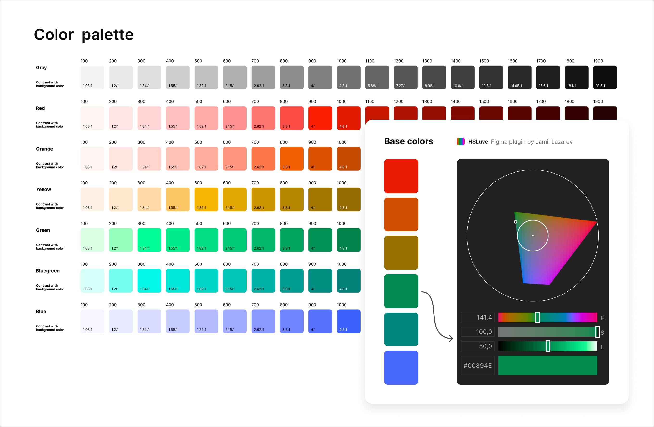
Color palette
2. Grid and spacing
A grid is essential for structured projects with a lot of data and tables. I chose a standard 4px-based grid with either 12 or 6 columns, depending on the breakpoint. Spacing between elements also followed a 4px scale for consistency.
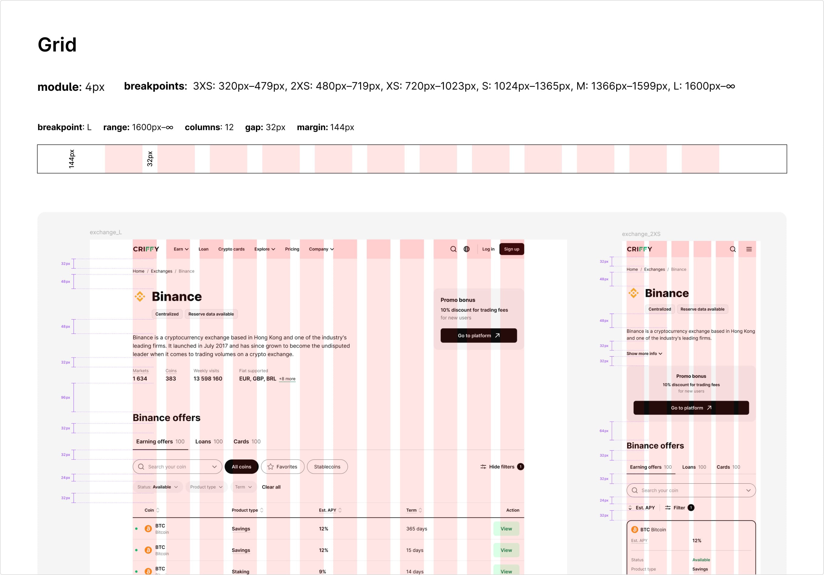
Example of grid for breakpoint L and 2XS
3. Typography
I chose “Inter” as the primary font for several reasons: it’s clean, highly readable and supports a wide range of styles, weights and languages. This was especially important for the project, which required localization into 9 languages, including Chinese.
To ensure optimal scalability, I divided breakpoints into 3 groups and created a set of text styles for each, using a progressive scaling approach based on a base font size.

Example of text styles for LMS breakpoints
Components
Next, I started building the design system components using Atomic Design principles, where simple elements are combined into more complex ones.

Example of nested components development
1. Component principles
Before diving into component creation, I defined a few key principles to follow:

Examples of application of principles
Each component was built using auto-layouts and a predefined spacing system. As new use cases appeared, I iteratively refined and improved components.

Example of a blog article card component
2. Templates
To maintain consistency, I created templates for similar pages and sections. This not only sped up the design and development process but also improved the user experience by providing familiar patterns across the interface.

Example of page template
Tone of voice
Tone of voice plays a crucial role in how a product communicates with users. If a design system defines a product’s appearance and structure, its tone of voice defines its personality.
Criffy’s users are young people interested in modern technology and finance, actively exploring new crypto investment opportunities. I chose a friendly, relaxed, yet still respectful tone, like a knowledgeable and approachable friend who’s always ready to help.

Tone-of-voice dimensions
Once the tone of voice was set, it was important to maintain it across all touchpoints, from emails and error messages to social media posts.

Examples of tone-of-voice use
Illustrations
Illustrations are another way to convey a brand’s values and voice. That’s why I consider the definition of illustration style to be a part of the design system.
Simplicity is one of Criffy’s key values, so I chose a minimalistic style using clean lines, simple shapes and a limited color palette. This ensured that illustrations complemented the black-and-white UI while adding visual accents where needed.

Examples of illustrations
Development
With the design system in place, developers built a component library, significantly speeding up the release of new features.
Results
The design system played a key role in speeding up the launch of the new service version, even though its impact became fully visible over time.
Next steps
I continue evolving the design system and have identified key areas for improvement: