
Challenge

Problem
Even though Options are a fairly simple trading tool, analytical data showed that a large number of traders never opened a single options trade after signing up, not even on the Practice account, where they didn’t risk real money. The main hypothesis: users simply didn’t understand how to trade options in the terminal.
Analysis of the existing solution
The existing onboarding for options trading was a step-by-step tutorial that popped up right after registration. It had the same flow for both the Web platform and the Android App.

Existing solution, Web
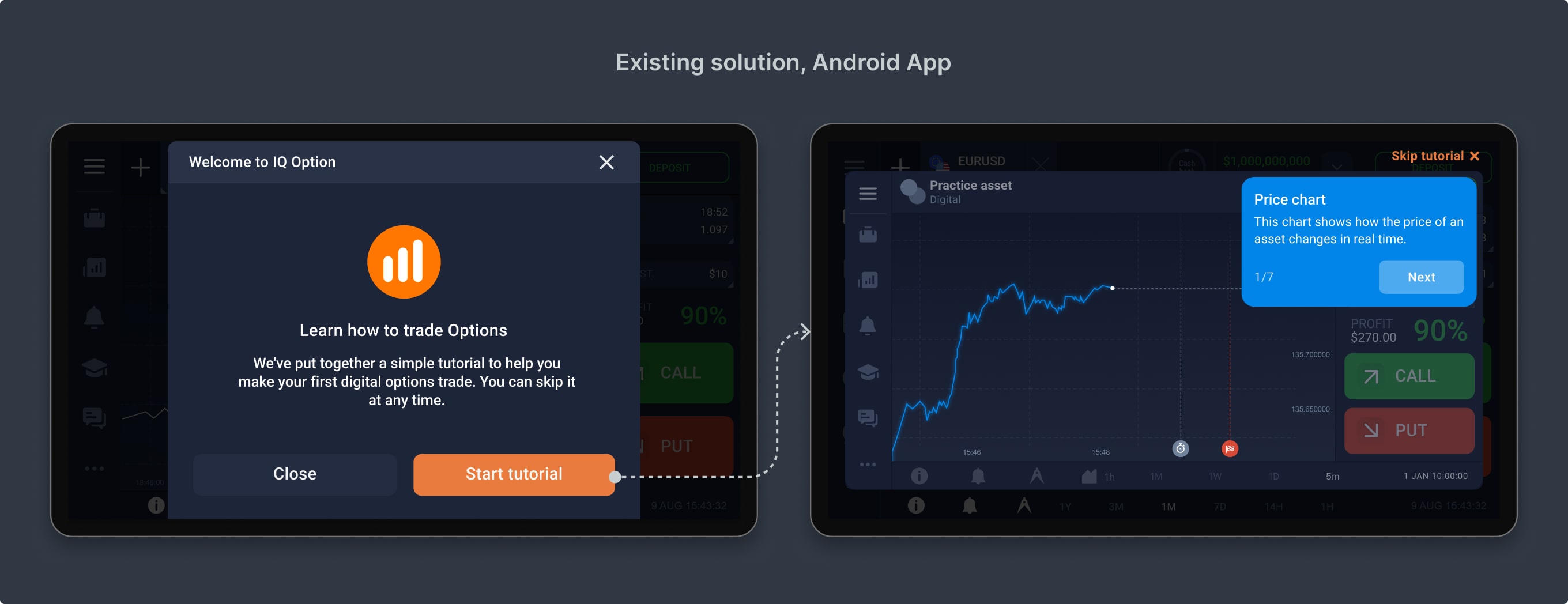
Existing solution, Android App
After analyzing the existing onboarding process, I identified a few key pain points:
Ideas
To improve the experience, I proposed two big directions.


The team was really excited about these ideas, so we planned to test them iteratively and track results step by step.
Iteration 1
Improving the existing onboarding popup
Since moving onboarding into the real interface required significant dev effort, I started with more achievable step: improving the current step-by-step popup flow.
Research
Working with Data Analysts, I identified the drop-off points in the onboarding flow where users stopped progressing.
The biggest conversion drop happened at steps requiring users to enter an investment amount and select an expiration time for a trade. At these points, the "Next" button disappeared from the onboarding widget. Users who didn’t carefully read the instructions didn’t know how to proceed and ended up refusing to take the training.

Steps with the biggest conversion drop
Solution
To improve the experience, I updated the interface on both the Web version of the platform and the Android app:
Example of the new onboarding screen, Web
Example of the new onboarding screen, Android App
A/B testing results
During the first A/B testing, we gathered the following significant results for Android App:
83% users didn’t skip onboarding on the first step
Conclusion
We noticed a drop in Practice trade conversion, but a rise in both first deposits and Real trades. Our hypothesis is that more users were now completing the final onboarding step where they placed a trade in the training popup. And then skipping practice trading altogether they deposited and started live trading.
Iteration 2
Expanding onboarding for a wider audience
Since the popup flow improvements showed strong results, the next step was to scale onboarding to better support a broader user base.
Research
The first step was to divide traders into three main groups based on their trading experience and behavior on the platform. This allowed me to design user flows tailored to each group separately.


User flow diagram
I mapped out the user journey for each group, considering their experience level and potential barriers.
This segmentation ensured that each trader got the right level of guidance without unnecessary friction.

User flow diagrams
Solution. Welcome screen
To better segment users based on their user flow, I redesigned the welcome screen after registration. Now, users could choose their own path:
This gave traders more control over their learning experience.
New welcome screen, Web
New welcome screen, Android App
Solution. Interface tour
Based on analytics data, I identified the most frequently used features by experienced traders in both the Web and Android versions of terminal. This helped me focus on the key areas when designing the trading terminal interface guide:
To improve engagement, each step activated only after the user interacted with the feature or clicked Next in the tour widget. If a user chose to exit the tour, I showed them where to find learning resources later. This approach ensured that users learned at their own pace while still getting the guidance they needed.

Example of the interface tour screen, Web & Android app
The 1st A/B testing
During the first A/B testing, we gathered the following significant results for Android App:
After analyzing the quantitative post-testing data, I suggested making some more changes to the onboarding flow and conducting the next phase of A/B testing.
What was changed: Removed the extra step between the Welcome popup and the start of onboarding, merging it with the Welcome popup.
The 2nd A/B testing
In our second A/B testing, we gathered significant results for both the Android App and the Web:
Conclusion
Fewer users started onboarding from the Welcome popup, but more users completed it. It is a sign that the popup became clearer and attracted only genuinely interested users. A/B tests confirmed our hypothesis: beginners tend to choose the Android app, while more experienced traders go for the Web version.
Next steps
The feature has been successfully launched and is now available in all supported countries. For the next phase, I’d suggest: